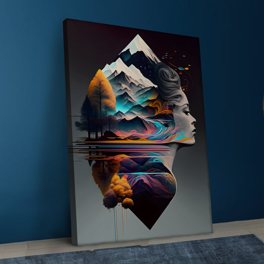
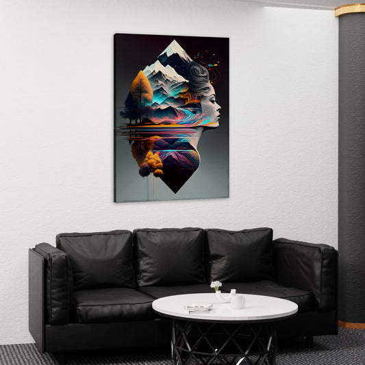
How to Use Canvas Prints to Enhance Your Home’s Color Palette
How to Use Canvas Prints to Enhance Your Home’s Color Palette
Understanding Color Theory
Before selecting canvas prints, it’s helpful to have a basic understanding of color theory. This will guide you in choosing colors that work well together and create the desired effect in your space.
- Primary Colors: Primary colors (red, blue, and yellow) are the building blocks of all other colors. They cannot be created by mixing other colors.
- Secondary Colors: Secondary colors (green, orange, and purple) are created by mixing two primary colors.
- Tertiary Colors: Tertiary colors are created by mixing a primary color with a secondary color. Examples include red-orange, blue-green, and yellow-green.
- Complementary Colors: Complementary colors are opposite each other on the color wheel and create a vibrant contrast when used together. Examples include red and green, blue and orange, and yellow and purple.
- Analogous Colors: Analogous colors are next to each other on the color wheel and create a harmonious and cohesive look. Examples include blue and green, red and orange, and yellow and green.
Tips for Using Canvas Prints to Enhance Your Color Palette
- Identify Your Existing Color Scheme: Start by identifying the existing color scheme in your room. Consider the colors of your walls, furniture, and accessories. Determine whether you want to reinforce this color scheme or introduce new colors to create contrast and interest.
- Choose Complementary Colors: If you want to create a bold and dynamic look, choose canvas prints with complementary colors. Complementary colors create a vibrant contrast that can make your art stand out and add energy to your space.
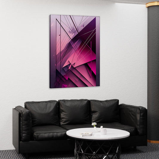
- Use Analogous Colors for Harmony: For a more subtle and cohesive look, choose canvas prints with analogous colors. These colors work well together and create a harmonious and calming effect. Analogous color schemes are ideal for creating a relaxing and balanced atmosphere.
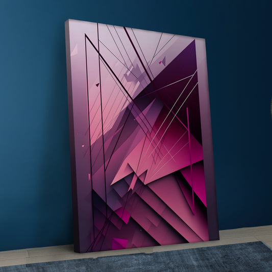
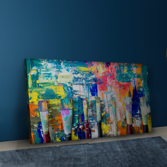
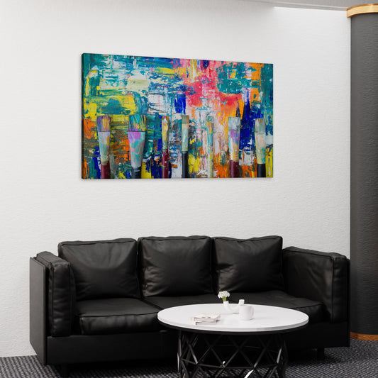
- Introduce a Pop of Color: If your room has a neutral color palette, use canvas prints to introduce a pop of color. Choose art with vibrant and bold colors to add visual interest and make a statement. A single colorful print can transform a neutral space and create a focal point.
- Reinforce Your Color Scheme: To reinforce your existing color scheme, choose canvas prints that feature the dominant colors in your decor. This creates a cohesive and unified look, tying the room together and enhancing the overall aesthetic.
- Create a Color Gradient: Create a color gradient by selecting canvas prints with varying shades of a single color. This technique adds depth and dimension to your decor, creating a visually interesting and dynamic look.
- Consider the Mood and Atmosphere: Think about the mood and atmosphere you want to create in your room. Different colors evoke different emotions and feelings. For example, blue and green create a calming and serene atmosphere, while red and orange add warmth and energy. Choose canvas prints with colors that align with the desired mood.
Examples of Enhancing Your Color Palette with Canvas Prints
Living Room
Existing Color Scheme: Neutral tones with beige, gray, and white.
Canvas Prints: Choose prints with a pop of color, such as vibrant blue or green, to add visual interest and create a focal point. Alternatively, select prints with analogous colors like soft blues and greens for a cohesive and calming effect.
Bedroom
Existing Color Scheme: Cool tones with blue and gray.
Canvas Prints: Choose prints with complementary colors like orange or warm tones like coral to create contrast and add warmth. Alternatively, select prints with varying shades of blue to create a soothing and serene atmosphere.
Dining Room
Existing Color Scheme: Warm tones with red, orange, and yellow.
Canvas Prints: Choose prints with complementary colors like blue or green to create a vibrant and dynamic look. Alternatively, select prints with analogous colors like orange and red to reinforce the warm color scheme and create a cozy and inviting atmosphere.
Home Office
Existing Color Scheme: Monochromatic with shades of gray.
Canvas Prints: Choose prints with a pop of color, such as bright yellow or teal, to add energy and creativity to the space. Alternatively, select prints with varying shades of gray to create a sophisticated and modern look.
Conclusion
Canvas prints are a versatile and effective way to enhance your home’s color palette. By understanding color theory and considering your existing color scheme, you can choose art that complements or contrasts with your decor to create a cohesive and visually appealing space. Whether you introduce a pop of color, reinforce your current scheme, or create a color gradient, canvas prints offer endless possibilities for enhancing your home’s color palette and creating a harmonious and stylish environment.

